The Drop Times: Shibin Das on Making Drupal Workflows Legible
Undpaul.de: Drupal Tip: How to change field length with existing data
Every Drupal developer eventually hits this wall: a client or editor requests that a standard text field (like a headline or subheadline) be expanded from 255 to 512 characters. You change the value in the field configuration YAML or try to update it programmatically via the Entity API, only to be hit with a fatal exception.
Nextide Blog: Someone Has to Hold the State: Maestro's Place in Drupal's Orchestration Stack
Randy Kolenko, partner and senior architect at Nextide, recently joined the Drupal Orchestration Initiative with Jurgen Haas, Shibin Das and Dries Buytaert. The Orchestration Initiative is still in its infancy, however, the discussions and (dis)agreements will continue until the vision of what Orchestration means to Drupal is sharpened.
Drupal Core News: Use Rector on your Drupal site easier than ever with new Composer-based sets
As of Rector 2.5, Composer-based sets now support Drupal! This allows you to automate version-specific custom code upgrades seamlessly.
Instead of manually adding dozens of configuration sets and keeping your list up to date as you upgrade to new Drupal releases, you can enable the new feature in your rector.php file. Rector will automatically inspect your composer.json, detect your exact installed versions of Drupal and its dependencies, and run the relevant refactoring sets. This means as you upgrade to newer versions of Drupal in the future, Rector will dynamically adapt and apply the correct upgrade rules without any manual config updates.
Add it to your siteInstall Drupal Rector with Composer:
composer require --dev palantirnet/drupal-rector:^1.0That pulls in Rector 2.5 or newer, which is where the interesting part lives. Then create a rector.php in your project root:
<?php declare(strict_types=1); use DrupalRector\Set\DrupalSetProvider; use Rector\Config\RectorConfig; return RectorConfig::configure() ->withPaths([ __DIR__ . '/web/modules/custom', __DIR__ . '/web/themes/custom', ]) ->withSetProviders(DrupalSetProvider::class) ->withComposerBased(twig: TRUE, phpunit: TRUE, symfony: TRUE, drupal: TRUE);And run it:
vendor/bin/rector processTwo lines of configuration does the work: withSetProviders registers the Drupal rules, and withComposerBased(drupal: true) tells Rector to select them based on what's actually installed. No version numbers need to be in your config.
The feature is backed by recent Drupal Rector 1.0.0 beta releases. Although we are still running a beta for Drupal Rector, the composer-based sets landed in Rector 2.5.0. Run it on your custom code, read the diff, and tell us where it's wrong.
How does it work?Rector reads the installed drupal/core version and loads every set up to and including that minor. A site on 11.4 loads the 11.0 → 11.4 rules. A site on 11.2 loads 11.0 → 11.2. When you upgrade core, the set selection moves with you. You don't need to change rector.php again.
That's the same mechanism Rector already uses for Symfony, Doctrine, Twig, and PHPUnit. Drupal is now a first-class citizen.
But the config was never the hardest part. The hard part was coverage. Automatic version selection is only worth anything if the rules behind it are good and preferably complete. That changed a lot when the Project Update Bot was refreshed for Drupal 12 readiness, pushing automated deprecation coverage past 80%. The bot and drupal-rector draw from the same well. Better coverage there is what made shipping this as the default setup defensible. The fact we also run all these rules against almost 10.000 contrib modules makes for some very good testing.
Even less work maintaing your Drupal site
Drupal rules will also appear on getrector.com/find-rule at a later date. That's the searchable catalogue of every rule Rector ships. Having Drupal in it means a maintainer can look up exactly which transformation handles a given deprecation, the same way they can for any other framework today.
Drupal 12 readiness isn't a one-time push, every new minor brings deprecations, and we will keep on adding any missing coverage. Because your setup selects rules by installed version, the rules you get tomorrow are the rules for the core you're running tomorrow. No migration step. You upgrade core, you run Rector, you're up-to-date.
Add it to a project this week. Point it at your custom modules, run vendor/bin/rector process, and open an issue when something doesn't transform the way it should. It's a beta because we want exactly that. Two lines of config, the correct rules for your version, automatically.
Also posted on Rector’s blog, big thanks to the author of Rector, Tomas Votruba for the collaboration on making this happen.
DrupalCon News & Updates: Digital Sovereignty Starts with Technical Choices
Digital sovereignty often sounds abstract but, in practice, it comes down to technical decisions: where data is stored, who controls the platform, how systems are maintained over time, and how much privacy, transparency, and independence is built in from the start.
These choices directly affect how digital services are designed and delivered. That is why digital sovereignty is a key theme at DrupalCon Rotterdam 2026. The event’s Digital Sovereignty & Open Web track connects platform strategy with architecture, governance, accessibility, regulation, and the long-term future of open digital ecosystems.
Image
Photo by Matthew Saunders
This is not only a policy discussion, it is also a practical one. Privacy-first architecture, public code, digital identity, accessibility, open-source infrastructure, and responsible AI all shape how organisations think about control and trust today. In that context, digital sovereignty is no longer a side topic, it's becoming part of how teams approach procurement, hosting, compliance, and long-term platform resilience.
That is what makes this conversation especially relevant in Rotterdam. Developers can connect values to implementation, digital leaders can look at governance and long-term control and public sector teams, accessibility advocates, and open-source contributors can all bring important perspectives to the same discussion.
Drupal has long been part of the open web story. At DrupalCon Rotterdam, digital sovereignty becomes a practical question: how do we build systems that remain open, secure, adaptable, and worthy of trust.
- Article by Daniela Moreira.
The Drop Times: Drupal 11.4.0 Delay Shows Dependency Patch Pressure on Core Releases
Webpro Company blog: Why does Drupal get slower over time?
mandclu: Alias Your Local DDEV Commands
PreviousNext: Our contributions to Drupal 11.4 - and the 11.x journey so far
Drupal blog: Drupal 11.4.0 is now available
The fourth feature release of Drupal 11 is another performance breakthrough. Using only a third of the database and cache lookups compared to Drupal 11.0 and 10.6 for the same requests. It also comes with 15-25% better compression of JS and CSS, much faster translation file handling, a new native command line interface, improved password hashing and a lot more.
New in Drupal 11.4 Biggest performance improvement of the decade (again!)With Drupal 11.3, we announced that it was the biggest performance improvement of the decade. Drupal 11.4 is arguably the biggest performance improvement of the decade again!
Drupal 11.4 reduces database queries by half compared to 11.3 across a wide range of requests due to optimizations in how entity fields are loaded.
Now, on a completely cold cache, Drupal 11.4 will execute just over 1/3rd of the database and cache lookups compared to Drupal 11.0 or 10.6, representing hundreds of milliseconds saved.
As well as entity loading, entity listing queries have also been significantly improved via reducing the number of table joins, leading to fewer slow queries. This should particularly benefit sites using JSON:API.
To reduce the cost of rendering menus and improve render cache hit rates, menu blocks now have a configuration option to not generate CSS classes for ancestor menu links.
Applying recipes, such as setting up Drupal CMS is twice as fastWe have made recipe-based site installation twice as fast. This significantly improves the UX of installing Drupal CMS and other site recipes. Installing individual recipes is also markedly faster.
Translation file handling: dramatically faster with a modern APIImporting translations during the installer or during site operation is now much faster. On a test site with 66 projects and 38 languages, checking for translation updates was 87% faster on Drupal 11.4 compared to 11.3.
The APIs handling translation files and import have undergone an extensive modernization effort. All .inc files and several important APIs in locale.module have been deprecated and updated to OOP with special attention paid to performance and organization.
15-25% better compression of JS and CSSDrupal now supports Brotli compression for aggregated CSS and JavaScript files in addition to the existing gzip compression. Brotli typically provides 15-25% better compression ratios than gzip, resulting in faster page loads for browsers that support it. The feature relies on the PHP Brotli extension: ext-brotli.
Immediate security updates of key dependencies allowed in core-recommendedThe drupal/core-recommended package no longer pins minor versions for dependencies like Guzzle, Twig, and Symfony Polyfills. In the past, stricter version rules and Composer 2.9's blocking behaviour forced sites to wait for a new Drupal release to get important security fixes. Now, you can install these security fixes immediately. Since the updated dependencies at that time may not have been tested with Drupal core yet, site owners should ensure adequate quality assurance occurs before deploying to production.
New experimental extensible native command line interfaceA new extensible ./vendor/bin/dr command line interface was added. While Drupal already includes a CLI script with hardcoded commands, it is not extensible. This new interface was built by a team which included the maintainers of the Drush utility. Drush has been a mainstay for people using Drupal with the command line. Now a transitional period starts as Drush is gradually replaced with the core dr CLI over time. Learn how to make your existing Drush commands compatible.
Simplified and updated default experienceThe default installation, the Standard profile, is now leaner. It no longer includes the Article and Page content types, and commenting is disabled by default. Further core startup simplifications are planned for upcoming releases.
The Navigation module is now enabled in the standard administrative interface. The legacy Toolbar module remains available but is scheduled for removal in Drupal 12.
A new overview page has been added under the "Manage display" tab for content entity bundles. Previously, this tab led to the form editing the default view mode. Now, it lists all display modes for the bundle with their label and description and allows one to toggle the enabled/disabled status. The listing makes it easier to integrate tools such as Drupal Canvas.
Distraction-free editing available with CKEditorText formats using CKEditor can now be configured to include the FullScreen plugin. This plugin lets users expand the editor to the whole browser viewport, giving more space to comfortably edit content in a distraction-free environment.
Improved password hashing availableThe password hashing algorithm is now configurable. The new argon2id option provides much stronger hashing compared to the old bcrypt method. Drupal 12 will default to argon2id, but your site can already start to adopt it. If you update the setting, users' passwords will be rehashed on their next login.
Do more with PHP attributesYou can now use attributes on your controllers to specify the routes the controller is used for. Any class in a module's Controller namespace (for example, Drupal\example\Controller) that have the Symfony\Component\Routing\Attribute\Route attribute will be picked up as route definitions. Even multiple routes can be defined on one class. This supplements the existing .routing.yml based declarations.
It is now possible to use the Drupal\Core\Entity\Attribute\Bundle attribute to define bundle classes, when in need of specific logic for an entity subtype. This previously required an entity_type_info or entity_type_info_alter implementation.
No more .theme files, only a few .module files leftAll .theme and .theme-settings.php files in core have moved to PHP classes. Support for .theme files is still planned to be retained in Drupal 12 to ease the transition, but will be removed in Drupal 13.
Most .module files have been converted too: 32 modules are fully converted to PHP classes, with 11 modules remaining (4 of which are deprecated for removal in Drupal 12).
A team of 26 key contributors worked on 57 issues since January 2026 to get here, making Drupal's code more consistent. Also thanks to the dozens of users that worked on the many decades old issues that this initiative built upon.
Front controllers now utilize symfony/runtimeDrupal now integrates the Symfony Runtime component to separate bootstrapping logic from request handling. This provides a clear separation of concerns between preparing the environment (runtime) and handling a request, which will also later enable better integration with FrankenPHP.
Write faster tests with new helper methodA new trait for kernel tests, HttpKernelUiHelperTrait, allows kernel tests to make HTTP requests to the test site and make assertions against the returned content. This has the potential for many browser tests to be converted to kernel tests, which are much faster to run because unlike browser tests, they don't fully set up a test site by running the Drupal installer.
New experimental administrative themeThe Gin administrative theme has been added to Drupal core as the "Default Admin" experimental theme. The theme includes a new dark mode option.
While it is not yet actually the default admin theme, when it becomes stable it will replace Claro as the look of Drupal's backend. We encourage module maintainers to test their module's UIs and provide feedback!
Core maintainer team updatesSince Drupal 11.3 Andrei Mateescu was appointed as a provisional general core committer and is now a Content Moderation and the Workflows module maintainer too. Also Edward Wu was appointed as provisional release manager.
Various wonderful contributors also took our call for subsystem maintainership:
- Moshe Weitzman is now a maintainer of the core CLI
- Derek Wright stepped up to be a Content Moderation and core CLI maintainer
- Kent Richards is a new accessibility maintainer
- Max Pogonowski was added as a maintainer for Menu UI and the token system
- Jürgen Haas and Sascha Eggenberger are maintainers of the new Default Admin theme
- Chris Weber was added as a maintainer for Settings Tray
- Stephen Mustgrave stepped up to maintain the Options module and Menu UI
- Lucas Hedding is now a maintainer for the Image module and the Authentication and Authorization subsystem
- Christian López Espínola is a new maintainer to the Language and Content Translation modules
We also thank maintainers that stepped down in this period:
- Heather Brooke Drummond stepped down from their maintainer role on Breakpoint and Responsive Image modules
- Brian Gilbert stepped down from his core mentoring role
- Wim Leers stepped down from being maintainer of Drupal's CKEditor integration, Editor module, JSON:API module and REST module
- Gareth Goodwin stepped down from maintaining the Umami demo
If you are looking to make the leap from Drupal user to Drupal contributor, or you want to share resources with your team as part of their professional development, there are many opportunities to deepen your Drupal skill set and give back to the community. Check out the Drupal contributor guide.
You would be more than welcome to join us at DrupalCon Rotterdam in September 2026 to attend sessions, network, and enjoy mentorship for your first contributions.
Drupal 12 is coming the week of December 7, 2026Drupal 12 will be released with the upcoming Drupal 11.5 at the beginning of December this year. Drupal 11.5 will be a Long Term Support release with version 11 support expected until the end of 2028.
File attachments: Drupal114Available.png DarkDrupalAdminPage.jpg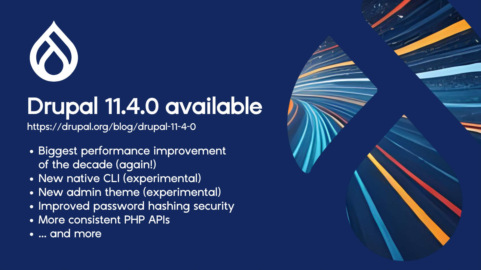
Drupal AI Initiative: The UN Spent a Week Describing Drupal
Image Credit: Mike Gifford
I spent last week at the UN in New York for Open Source Week. The AI sessions were sharp, well-attended, and full of people who have been thinking seriously about where this is all going. Ministers, engineers, researchers, cybersecurity practitioners.
And across four days of sessions, a picture kept assembling itself — not one anyone drew deliberately, but one that emerged from enough different people making enough adjacent points. By the end of the week I was fairly convinced that what the AI world is urgently trying to build, Drupal already is.
Read on and let me make the case.
The model is not the thingBrian Behlendorf said it plainly: people talk about AI as if it's the model. It isn't. The model is one layer. What matters is the harness. How you orchestrate models, constrain them, route information, log outputs, build verification in. That's where the work happens. That's where the risk lives and where we create value.
Sara Hooker from Adaptation Labs made the same point from a different angle. We used to work in code and design. Interfaces were understood and boundaries were mostly clear. AI has moved us into unknown interfaces. The next step, she said, is dynamic, adaptable interfaces that allow humans to remain at the centre. Not interfaces that hand control to the model, but ones that keep the human in the loop while the model does the work.
I've been saying that Drupal has quietly become the most flexible and powerful AI harness available. This week gave me a room full of smart people explaining which helped bring that conviction into focus.
What a harness needs to doLet me pull a few threads from the week.
It needs to constrain the model to known truth. One of the most interesting presentations came from a team that deployed a chatbot for Pittsburgh's Public Works department. The very first question from city officials was: "How do we know the answer is correct?" Their solution was a Data Concierge model — the AI is only permitted to answer questions against a defined dataset. If it can't answer from the data, it doesn't answer; the question goes into a queue. This makes the AI responses reproducible, traceable, and auditable.
That is what Drupal can do when you integrate AI into a content management workflow. The model doesn't get to hallucinate about your organisation's policies. It answers from what you've published, structured, and governed. The content model is the constraint.
It needs to aggregate intelligence, not just query a single model. Mostafa Elkordy from UNICC put this as clearly as anyone: every agent in isolation only has its own memory. The most critical and least understood capability in enterprise AI is intelligence harnessing. We need to pull all intelligence sources into a single coherent system. The organisations that figure this out will have a structural advantage. The ones that treat AI as a chat widget bolted onto a webpage will not.
Drupal's architecture is built for this. You have multiple data sources, multiple content types, relationships between entities, and views that aggregate and filter. This is what structured content management systems do best. Adding AI to that foundation is a multiplier. Adding AI to an unstructured system makes a mess.
It needs to keep humans in control, not in the dark.
Rodrigo Rodríguez, an AI & Quantum Architect at Microsoft made a point early in the week that I keep coming back to: AI is clustered around organised confidence. It rarely says "I don't know." Confidence is not evidence. The harness is the mechanism by which you decide what the AI is allowed to be confident about, and when it should surface uncertainty rather than paper over it.
Drupal's editorial workflows, content moderation, and publishing controls are part of a governance layer that sits between AI output and public consumption. A model can draft. A human approves. That's not a limitation. In fact, that's the architecture working as intended.
The verification problemTricia Wang made the argument I found most compelling across the entire week. We live in a claims-based AI world. A model asserts something is true. You have no mechanism to verify it independently. She called for a move to a verification-based world — ideally cryptographic — where claims can be checked against sources without exposing the underlying data.
She also made an observation that seemed obvious once she said it: we trust agents all the time. Every time you board a plane, you're trusting an agentic system — pilots, air traffic controllers, flight management software. We know how to govern this. We have liability frameworks, certification requirements, black boxes, independent investigation bodies. We just haven't built any of that for AI yet.
What Drupal offers in this space is structural transparency. Content has provenance. You can see who created it, when, what revision it's on, what workflow state it passed through. When AI is integrated into that system, the AI's contributions can be logged, reviewed, and attributed in the same way. That's the beginning of a verifiable AI layer — not cryptographic yet, but architecturally honest in a way that most AI deployments are not.
The zero-day exploit window is now down to seven days, according to Jim Zemlin from the Linux Foundation. In 2020 it was sixty. The security argument for keeping AI tightly integrated with auditable, open-source infrastructure isn't a theory. It is a requirement.
The sovereignty argumentDavid Shrier from Imperial College described intelligence as the next sovereign battlefield. The concentration of AI capability inside roughly eight companies is a structural problem. Hyperscalers are, in effect, concentrations of intelligence. Open source is the mechanism for distributing that intelligence more broadly.
Tanzania's Minister of Technology put it in terms I found more useful: her government is no longer a passive consumer of technology. It's an active creator. 90% of government systems are on open source. The savings from licence elimination have been reinvested in people. The workforce now owns the systems it builds.
The Drupal parallel is direct. When you run AI on Drupal, you're running it on infrastructure no single vendor controls. The model can be swapped. The hosting can be changed. The data stays yours. This is not a minor point — the lock-in risk in AI is real, and it's coming fast. The organisations building AI on proprietary stacks are creating dependencies they will spend years trying to unwind.
Morocco is building a 1 GW data centre and training 100,000 people a year in digital skills, specifically so it can run sovereign AI infrastructure with local values embedded. That's "open source as an instrument of sovereignty" at national scale. The same logic can apply at the organisational level.
The governance argumentThe DPI sessions drove home a point that applies directly to AI: the technical system is rarely the problem. The governance is. Ethiopia has 98% ID coverage and 92% payment wallet adoption — and yet fewer than 5% of people can actually access the protections those systems are supposed to provide. The technology works but the governance doesn't.
Armando Manzueta from the Dominican Republic put it cleanly: treat AI with the same governance rigour as your core infrastructure. Without proper guardrails and oversight, you shouldn't do it at all. Human oversight must be embedded so mistakes can be corrected in real time.
This is an argument Drupal has been making implicitly for twenty-five years. Content governance — who can publish what, when, through what process — is the foundational problem that Drupal was built to solve. The workflows, roles, permissions, and moderation tools are a governance system for information. Extending that to AI output is not a conceptual leap. It just extends what Drupal already does.
The PremiseHere is the argument in full: the AI conversation at the UN kept arriving at the same destination from different directions. You need a harness, not just models. The harness needs to constrain the model to verified data. It needs to aggregate intelligence across sources. It needs human oversight and editorial control. It needs to be open source so it can be audited, forked, and owned. It needs governance built into the architecture, not bolted on afterwards.
What does that remind you of? Drupal with AI integration.The Drupal work isn't finished. The AI modules aren't mature yet. The work won't be easy. I'm suggesting that the architectural foundation is right, and the architectural foundation is the hardest part. Most organisations are trying to build AI workflows on systems that weren't designed for governance, structured content, or auditability. They're going to spend a lot of time and money discovering what the DPI world learned the hard way: the technology problem is tractable. The governance problem is where things break. Our community even has a Road Map that describes many of these challenges.
Drupal solved the governance problem for content a long time ago. That foundation is now worth something more than it was worth two years ago.
Matthew Saunders works in AI and open-source infrastructure at amazee.io and has been building on Drupal since 2006.
File attachments: 55357069511_d841e14953_o.jpg
mark.ie: My LocalGov Drupal contributions for June 2026
At last, I've started work on microsites demo content.
markconroy 1st Jul 2026LakeDrops Drupal Consulting, Development and Hosting: The ECA Guide Revolution: Documentation Meets AI
ECA documentation stopped being only for humans. The ECA Guide at ecaguide.org is now machine-readable infrastructure - an MCP server at /mcp with three tools (search_docs, get_page, list_sections), an llms.txt structured index, llms-full.txt with about 151,000 words, and clean Markdown for any page by adding index.md to its URL. All 1,206 plugins are documented and auto-generated at /plugins/. An AI agent skill packages this: point an agent at the Guide, describe a workflow in plain English, and watch it read the token-syntax docs humans skip and build a working model with the right tokens on the first try. The numbers back it up. Over the last six months, humans made about 11,400 visits and 17,300 page views; machines through the MCP server made about 244,000 visits and 734,000 page reads. Around 21 times more visits and 42 times more reads from machines than humans (with honest caveats: machine traffic includes crawling, and an agent read is not a human learning). The pattern works for any complex Drupal system - Views, Layout Builder, Commerce could all do it. Documentation becomes infrastructure, and Drupal becomes AI-native rather than AI-adjacent.
Drupal AI Initiative: Which AI Summit Is Right for You at DrupalCon Rotterdam?
Artificial intelligence is changing how we build, manage, and deliver digital experiences. But AI isn’t just a developer conversation. It’s also a conversation for architects, product owners, marketers, digital strategists, executives, and organisational leaders.
That’s why DrupalCon Rotterdam is introducing two dedicated AI summits on Monday, 28th September. Each has a different focus, but together they provide a complete picture of what AI means for the future of Drupal.
The AI Dev SummitThe AI Dev Summit is built for the people creating the next generation of Drupal experiences.
If you enjoy building, experimenting, and solving technical challenges, this summit is for you. Sessions focus on practical implementation, emerging AI capabilities, and the tools developers need to begin building AI-powered Drupal solutions today.
Topics include:
- AI-assisted development
- Drupal AI and Drupal CMS
- Canvas and modern AI workflows
- Building with AI frameworks and services
- Real-world technical demonstrations
- Best practices from experienced contributors
Whether you’re already working with AI or just beginning to explore what’s possible, the AI Dev Summit offers practical knowledge you can apply immediately.
The Enterprise AI SummitTechnology alone doesn’t create transformation. Organisations also need leadership, governance, strategy, and clear business objectives.
The Enterprise AI Summit focuses on those conversations.
Designed for digital leaders, executives, product managers, architects, and decision-makers, this summit explores how organisations can responsibly adopt AI while delivering measurable value.
Sessions examine questions such as:
- How should organisations develop an AI strategy?
- What governance models are needed?
- Where can AI deliver measurable business value?
- How do security, privacy, and compliance influence adoption?
- What organisational changes are required for successful AI implementation?
- What projects have leading global organisations deployed?
Rather than concentrating on implementation details, this summit focuses on helping organisations make informed decisions about AI.
Different audiences. Shared goals.While each summit has its own emphasis, they are closely connected.
Successful AI initiatives require both technical expertise and organisational leadership.
Developers need leaders who understand the opportunities and challenges AI presents. Leaders need developers who can turn strategy into working solutions.
By offering both summits, DrupalCon recognises that AI adoption succeeds when technical innovation and business strategy move together.
Which summit should you attend?Choose the AI Dev Summit if you:
- Build Drupal websites and applications
- Want hands-on technical sessions
- Are interested in Drupal AI, Canvas, and AI development tools
- Enjoy learning by seeing practical demonstrations
- Meet the makers of Drupal AI and expert practioners
Choose the Enterprise AI Summit if you:
- Lead digital strategy or technology initiatives
- Make technology investment decisions
- Manage products, teams, or digital transformation
- Want to understand how AI fits into organisational goals
- Meet leading practitioners and peers who have delivered successful solutions within their organizations
Of course, if your role bridges both worlds, you’ll likely find value in either summit.
Join us in RotterdamWhether you’re writing code, defining strategy, or helping your organisation navigate the future of AI, DrupalCon Rotterdam has a summit designed for you.
Whichever path you choose, you’ll leave with practical insights, new connections, and a deeper understanding of how AI is shaping the Drupal ecosystem.
We look forward to seeing you in Rotterdam.
File attachments: banner_web_3400X720 (002).png
ImageX: Managing Colour in Drupal: Practical Tools for Modern Websites
Colour brings life and vibrancy to your Drupal website and shapes how people feel when they visit it. The right palette can make your site feel bold and dynamic, warm and cozy, or reserved and professional. Colours enhance user experience by clarifying your website’s hierarchy and making interactive elements easier to recognize. That being said, colours are an essential part of a compelling Drupal website design.
DevCollaborative: Meeting the Moment With Tiny Services
To better serve smaller organizations and those in a budget crunch, we’ve launched Tiny Services.
Jacob Rockowitz: Vibing Drupal: New Kids on the Block
Anxiety about AI
The Drupal and broader software community are getting overly anxious about the new kids on the block… AI. I wanted to step back and explore this anxiety through the analogy of AI as the new kids on the block, or, more specifically, the new kids entering our software teams and community. It is important to view AI not as a single kid because AI consists of multiple LLMs and harnesses.
Therefore, our immediate expectation when working with AI is that there is no single way to prepare for or interact with AI that always works across all AIs. The inconsistency and unpredictability of the current state of AI, and how it impacts our work, is making people anxious, which is leading them to want tools and processes to prepare to collaborate with AI. I'm writing this post because I think people's anxiety about AI is making them overprepare.
Overpreparing for AI
A large part of the AI narrative centers on the tooling you need to use AI. I feel that most of the AI tooling is overbuilt or overplanned. At the same time, harnesses like OpenCode provide essential tools and methodologies for an LLM to write code and perform tasks. Still, a harness is just a tool for AI, like the computer and software I am using to write this post.
The tooling and planning I am concerned about involve AI-specific processes for managing and orchestrating AI agents. Many people in the software community are developing AI best practices to address the challenge of integrating AI into our software development process.
A quick aside. I think having AI best practices for Drupal as a collaborative, community-led initiative is essential to Drupal's proper adoption of agent-driven development. Before someone starts using Drupal's AI best practices, they should understand what AI is.
What exactly is AI?
I don't know...Read More
Dries Buytaert: The privilege of AI in Open Source
Back in 2019, I wrote that Open Source is not a meritocracy. Meritocracy says talent is the only thing that counts, but that is not true. To contribute, you also need time, a steady income, and a flexible schedule. Plenty of people lack one or more of these.
Some people can give their nights and weekends to learning a codebase, clearing the issue queue, or reviewing patches. Some are paid to do it on the clock. A lot of people can't do either. Their hours go to a second job, caring for family, or simply making it through the week.
That doesn't make these people less talented. It means they have less opportunity.
AI changes that math. A contributor might have the skill to fix a bug, but not the time to learn an unfamiliar codebase. AI can explain unfamiliar code and point them to where the fix belongs.
On paper, that should be great news for Open Source. In practice, AI will only help if access and skill become shared, not private advantages.
AI access is not equal. The most capable models and coding agents cost real money, and using them well takes real skill. I pay hundreds of dollars a month for these tools and have spent countless hours learning when to trust them, when to doubt them, and how to turn their output into useful work. Many contributors do not have that money or that time.
We learned once that "anyone can contribute" is not the same as "everyone has the same opportunity to contribute". AI can repeat that mistake in a new form.
Powerful technologies rarely share their benefits evenly at first. Electricity did not create equal opportunity the moment it was invented. It only changed lives broadly when people built the infrastructure to make it widely available.
The internet followed a similar path: it started with privileged access, then became useful to millions more people as infrastructure, tools, and skills spread.
AI is following the same pattern. It is powerful, imperfect, and unevenly distributed. We should not ban AI or pretend it has no flaws. If we want it to become broadly useful, more people need access to it and the knowledge to use it well.
If we want AI to reduce privilege in Open Source instead of reinforcing it, we have to close two gaps.
The first is cost. Contributors should be able to do meaningful work without paying for the most expensive AI tools. As lower-cost models, including open-weight models, improve, Open Source projects should make them practical for contribution work.
The second is skill. Knowing how to use AI well should become shared knowledge within Open Source projects so more people can learn faster and make better contributions.
Contributing with AI should come down to talent, not to who can afford the best tools or who has the time to learn them.
Open Source already moves many things from private advantage to shared infrastructure: code, documentation, test suites, best practices, decision-making processes, and even the financial side of our projects. The ability to use AI well for contribution should move in the same direction.
The opportunity is not just to make today's contributors faster. It is to help many more people become Open Source contributors: people with the talent, but not the free time, the insider knowledge, the employer backing, or the money for the best tools.
But more contribution is not automatically progress. As I wrote in AI creates asymmetric pressure on Open Source, AI can make it cheaper to contribute without making it cheaper to review.
The test is whether it helps more people move from issue to tested patch while making the result easier for maintainers to trust and merge.
If we do this well, AI can reduce the privilege of free time, insider knowledge, and expensive tools. If we do it poorly, it will widen the gap for contributors and increase the burden on maintainers.
In 2019, I argued that Open Source communities should create opportunity by paying contributors. I still believe that. Paying contributors gives people time. But AI gives us another way to reduce the privilege of free time: it helps people do more with the time they have.
I want Drupal to help explore what that looks like in practice: not because we have all the answers, but because this is the kind of problem Open Source should help solve.
Specbee: Build and publish pages with Drupal Canvas AI without waiting on developers
Acquia.com - Drupal Blog: Pick Your Starting Point: A Complete Guide to the Drupal Site Templates Marketplace
- 1
- 2
- 3
- 4
- 5
- 6
- 7
- 8
- 9
- …
- nächste Seite ›
- letzte Seite »